The Strategic thinking, creative direction, and design process
Design Process Overview
Rationale Behind the Brand Identity
Eden Art Gallery was envisioned as more than a space for viewing art — it’s a sanctuary where the organic beauty of nature meets the human creative spirit. The challenge was to create a visual identity that could express this subtle tension between wild inspiration and refined curation.
The goal was to design a brand that feels both timeless and contemporary, appealing to a niche of artists and buyers who value quality, intentional design, and emotional connection to art rooted in nature.
We aimed to achieve:
Elegance without excess
Nature without clichés
A brand presence that breathes, not shouts
1. Discovery & Strategy
Understanding the soul of the brand.
I began by identifying the gallery’s core values:
Artistic curation over mass-market appeal
Nature as a source of inspiration and calm
A focus on mindful, immersive experiences for both artists and visitors
Defining the target audience:
Independent artists, inspired by nature and minimalism
Collectors who are design-conscious and emotionally connected to nature
People who seek meaningful, curated art experiences
Brand keywords were identified: → Organic, Minimal, Calm, Elegant, Timeless
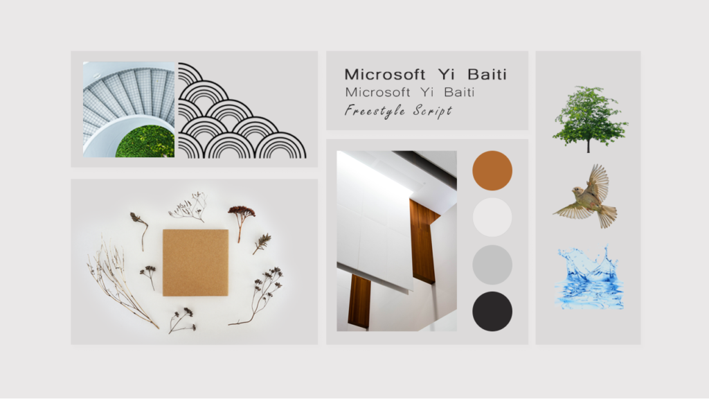
2. Visual Exploration & Moodboarding
Setting the tone and direction.
I created visual moodboards around:
Natural textures (stone, linen, foliage)
Gallery spaces with soft lighting and negative space
Elegant serif typography paired with sans-serif for balance
Earth-toned color palettes with warm neutrals and natural greens
This phase helped shape a visual tone that balances sophistication with a raw, grounded feel.
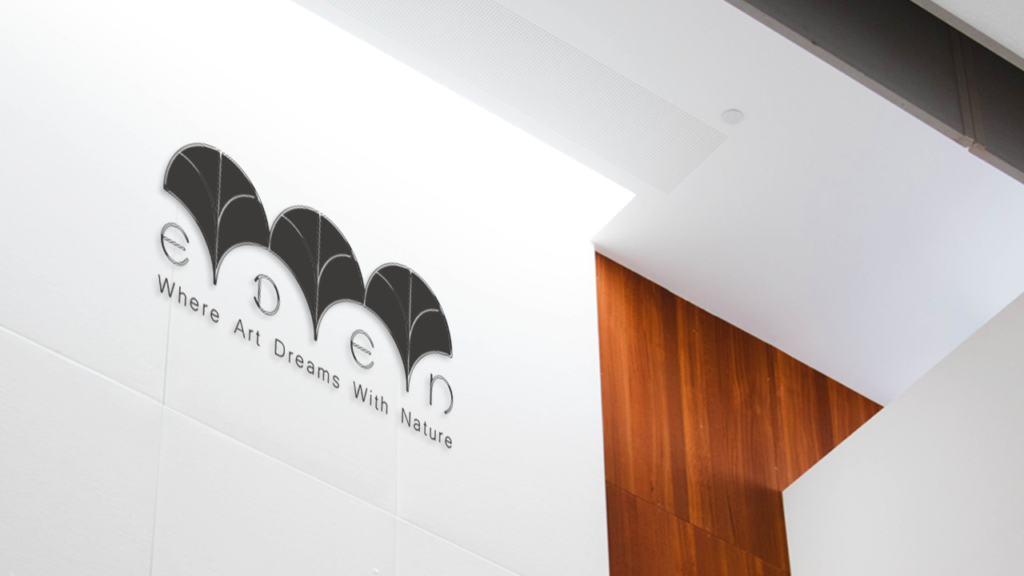
3. Logo Development
Creating a strong visual symbol of the brand.
I explored several logo directions before refining a mark that:
Embraces fine-line elegance, reflecting the gallery’s quiet strength
Suggests natural flow through spacing and typography
Works well in various formats (full logo, emblem, monogram)
The final result: A logo that could sit on a wall plaque, a business card, or a linen tote — and still feel intentional and refined.
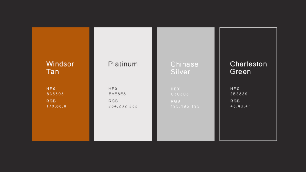
4. Typography & Color System
Building a system that feels elegant, accessible, and calming.
Typography:
You paired a modern serif (representing heritage and depth) with a clean sans-serif (for a minimal, contemporary tone).
This combination supports a flexible visual hierarchy — from gallery titles to web body text.
Color Palette:
Chosen from natural references (leaf orange, white-grey, charcoal gray)
Balanced to support high-end visuals and create a soft atmosphere across all touchpoints.
This system provides consistency across digital and print materials without overpowering the artworks on display.
5. Iconography & Graphic Language
Adding a subtle, symbolic depth to the brand.
I designed a set of custom icons inspired by:
Sketchbook-style details to hint at the artistic process
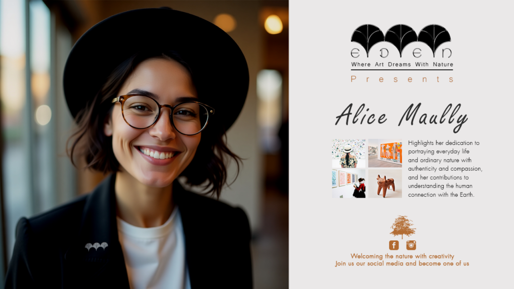
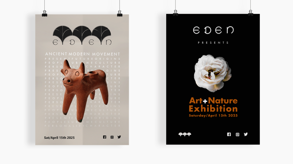
6. Brand Applications & Mockups
Bringing the brand to life in real-world contexts.
This phase was about building emotional resonance through touchpoints like:
Gallery posters and invitations
Signage that blends with interior architecture
Merchandise that feels like a keepsake
A digital presence that mirrors the gallery’s calm, organic aesthetic
Mockups helped visualize how the brand would perform in everyday use, and builds trust in your identity system.
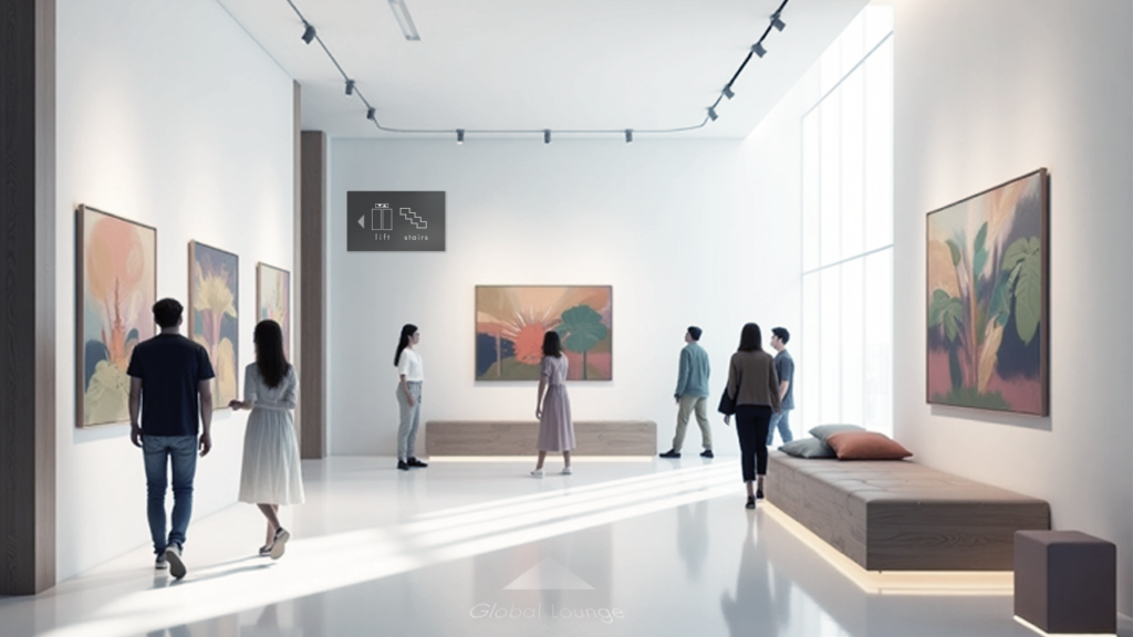
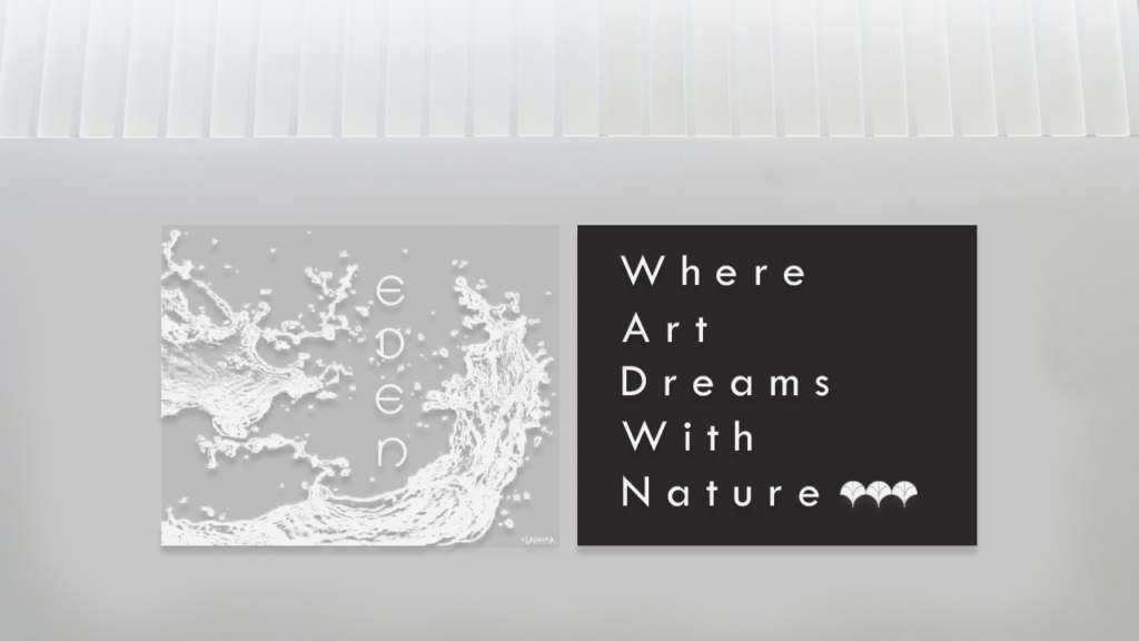
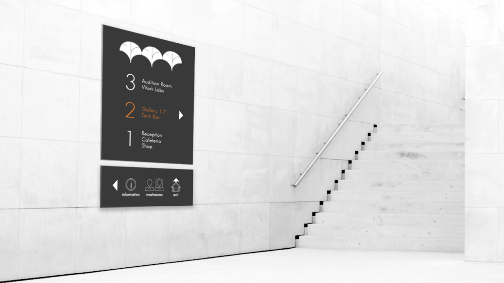
7. Interior & Spatial Branding
Extending the brand beyond the logo — into the experience.
You translated the visual identity into environmental design by considering:
Material choices (wood, linen, matte finishes)
Color continuity in furniture, walls, and signage
Soft lighting and ample whitespace
Everything from a welcome sign to the gallery layout supports the same immersive, art-meets-nature story.